
A digital home as considered as the spaces they design.
Footprint Designis an architectural practice working across developments, private residential and sacred spaces. We built them a site held to the same standard as the buildings on it. It’s live at www.footprintdesign.net.
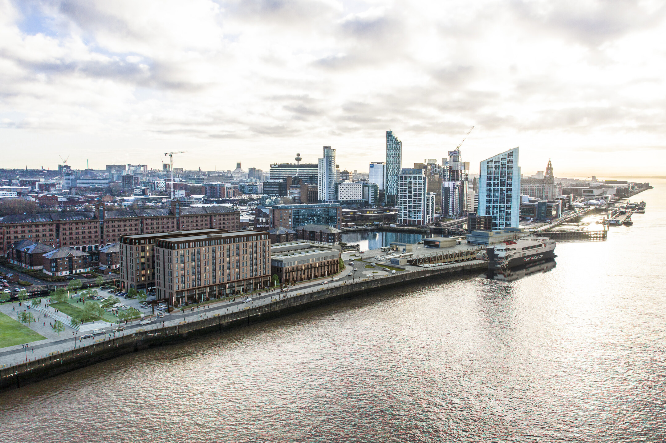
Deliverable
Marketing website
Services
Art Direction, Web Design, Front-end
Sectors
Developments · Residential · Sacred
An identity rooted in material and place.
The Palette
Almost everything sits on the dock-water navy. Sage does the pointing — buttons, links, small accents — and paper cream takes over when a page needs daylight.

The Mark
A plain wordmark and one footprint glyph. It holds up shrunk into a favicon and blown up on a site hoarding.
Elms Sans · Bold 700
Footprint
Regular 400
Developments, private residential and sacred spaces.
Typography
One family does everything. Bold and tightly tracked for the headlines, regular for anything you actually have to sit and read.
A home that moves.
A practice that works in three dimensions shouldn’t introduce itself with a still photo. The homepage opens on a silent film loop you can turn the sound on for. A one-line practice statement sits over it for a few seconds, then gets out of the way.
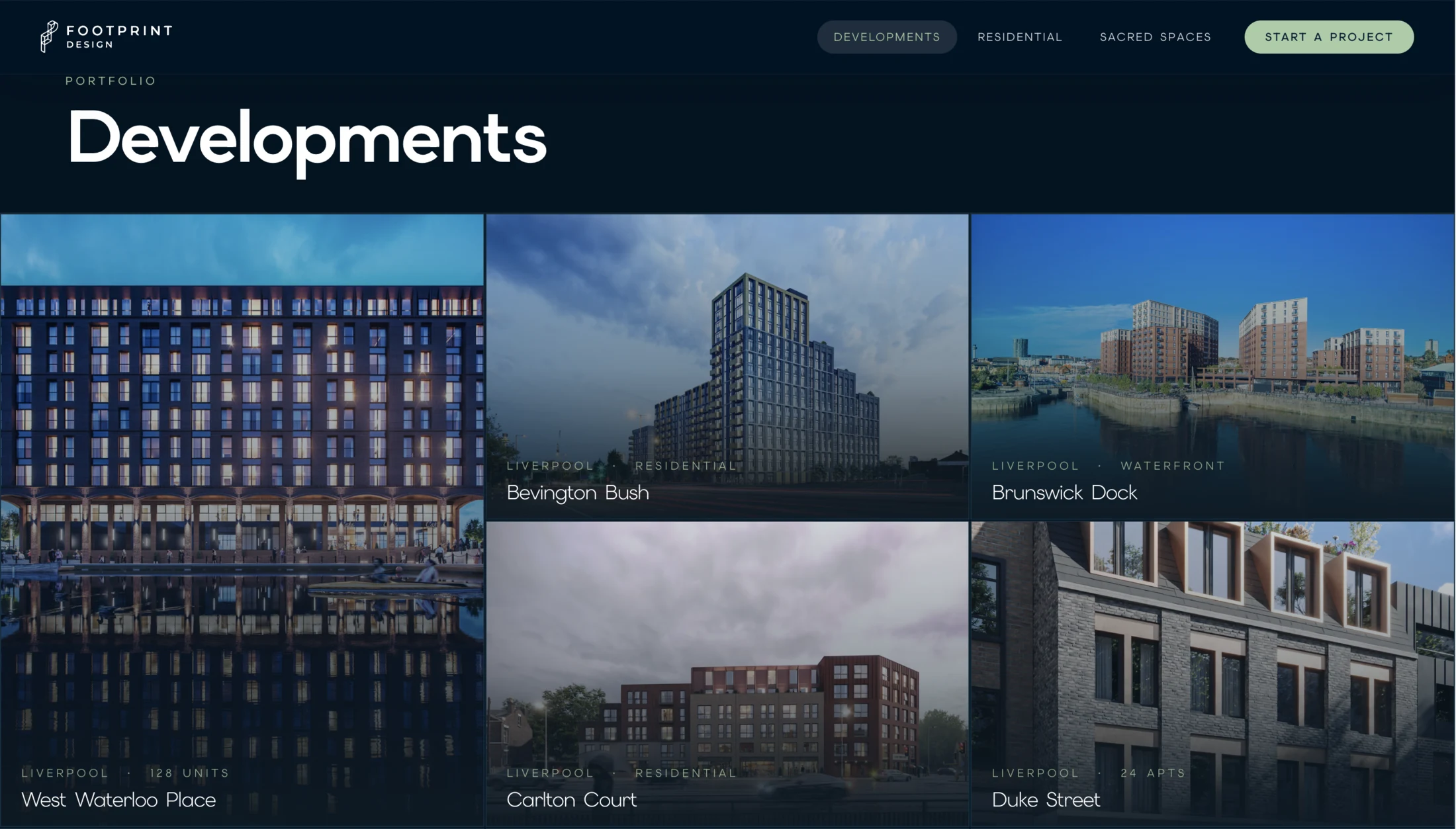
The whole portfolio, at a glance.
Developments sit in a bento grid: the feature project takes the big tile and the rest fill in around it. Every card shows its location and scope, so nobody has to click through six pages to work out what the practice actually does.
One development, read by scrolling.
Each project runs as a timeline — Site, Design, Delivery, Completion. Scroll and the imagery cross-fades, the figures count up, and the whole story of a development arrives at whatever pace you set.